Python Matplotlib
Table of Contents:
- Set figure size and dpi
- Creating sublots
- Graphs labeling
- Subplots labeling
- Multiple plots
- Multiple scatter
- Different scatter color
- Different scatter size
- Multiple subplots
- Lines
- Pcolor and Pcolormesh
What would be the crucial knowledge to successfully create matplotlib based graphs?
Set figure size and dpi
First you can control the figure size and dpi quality of the plot.
import matplotlib.pyplot as plt
plt.figure(figsize=(3, 4), dpi=50)
Bigger figsize and dpi,bigger the plot will be.
Creating sublots
matplotlib new api can now create subplots. You can use add_subplot method for this purpose:
import matplotlib.pyplot as plt
fig = plt.figure()
fig.add_subplot(2,2,1)
plt.show()
Associated method gca may be handy:
ax=plt.gca()
gca means “get current axes”, and it may help you find the “current” or last active axes.
If there is no axes yet, an axes will be created. If you create two subplots, the subplot that is created last is the current one.
Instead of getting the ax handle like above, it is smarter to create handles at once:
import matplotlib.pyplot as plt
fig = plt.figure()
ax1 = fig.add_subplot(2,2,1)
plt.show()
This way you don’t need to use gca() method. You have another alternative to create subplots with the subplots method. Following two examples will provide equivalent results:
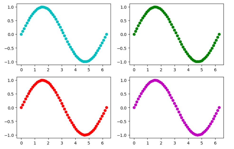
Example 1: Using subplots
import matplotlib.pyplot as plt
t = np.linspace(0, 2*math.pi, 60)
a = np.sin(t)
fig, (ax) = plt.subplots(ncols=2, nrows=2)
plt.rcParams["figure.figsize"] = (9,6)
plt.rcParams["figure.dpi"] = 200
# or plt.figure(figsize=(9, 6), dpi=200)

ax1=ax[0][0]
ax2=ax[0][1]
ax3=ax[1][0]
ax4=ax[1][1]
ax1.scatter(t,a,c='c')
ax2.scatter(t,a,c='g')
ax3.scatter(t,a,c='r')
ax4.scatter(t,a,c='m')
plt.show()
Example 2: Using add_subplot
import matplotlib.pyplot as plt
t = np.linspace(0, 2*math.pi, 60)
a = np.sin(t)

fig = plt.figure(figsize=(9, 6), dpi=200)
ax1=fig.add_subplot(2,2,1)
ax1.scatter(t,a,c='c')
ax2=fig.add_subplot(2,2,2)
ax2.scatter(t,a,c='g')
ax3=fig.add_subplot(2,2,3)
ax3.scatter(t,a,c='r')
ax4=fig.add_subplot(2,2,4)
ax4.scatter(t,a,c='m')

plt.show()
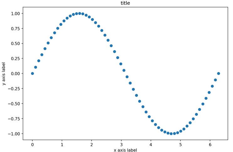
Graphs labeling
If you don’t use subplots you can use old api:
import matplotlib.pyplot as plt
t = np.linspace(0, 2*math.pi, 60)
a = np.sin(t)
fig = plt.figure(figsize=(9, 6), dpi=150)
plt.title("title")
plt.xlabel("x axis label")
plt.ylabel("y axis label")
plt.scatter(t,a)
plt.show()
Subplots labeling
Subplots uses new api for labels like this:
import matplotlib.pyplot as plt
t = np.linspace(0, 2*math.pi, 60)
a = np.sin(t)
fig = plt.figure(figsize=(9, 6), dpi=150)

ax1=fig.add_subplot(1,3,1)
ax1.title.set_text('First Plot')
ax1.set_xlabel('first xlabel')
ax1.set_ylabel('first ylabel')
ax1.scatter(t,a,c='c')

ax2=fig.add_subplot(3,3,2)
ax2.title.set_text('Second Plot')
ax2.set_xlabel('second xlabel')
ax2.set_ylabel('second ylabel')
ax2.scatter(t,a,c='g')

plt.tight_layout()
plt.show()

With the new subplots idea and labels idea for subplots you can have this boilerplate:
import matplotlib.pyplot as plt
t = np.linspace(0, 2*math.pi, 60)
a = np.sin(t)
fig = plt.figure(figsize=(9, 6), dpi=150)
ax1=fig.add_subplot(1,1,1)
ax1.title.set_text('title')
ax1.set_xlabel('x axis label')
ax1.set_ylabel('y axis label')
ax1.scatter(t,a)
plt.show()
Multiple plots
Adding multiple plots to the same plot is possible:
import numpy as np
from matplotlib import pyplot as plt
t = np.linspace(0, 2*math.pi, 800)
a = np.sin(t)
b = np.cos(t)
plt.figure(figsize=(9, 6), dpi=75)
plt.plot(t, a, 'r') # red
plt.plot(t, b, 'g') # green
plt.show()

However, I would always use this way:
import numpy as np
from matplotlib import pyplot as plt
t = np.linspace(0, 2*math.pi, 800)
a = np.sin(t)
b = np.cos(t)
fig = plt.figure(figsize=(9, 6), dpi=150)
ax1=fig.add_subplot(1,1,1)
ax1.title.set_text('title')
ax1.set_xlabel('x label')
ax1.set_ylabel('y label')
ax1.plot(t, a, 'r') # red
ax1.plot(t, b, 'g') # green
plt.show()
We used in here the numpy sin and cos functions, these are different from the
import mathsin and cos functions that work on scalars only.
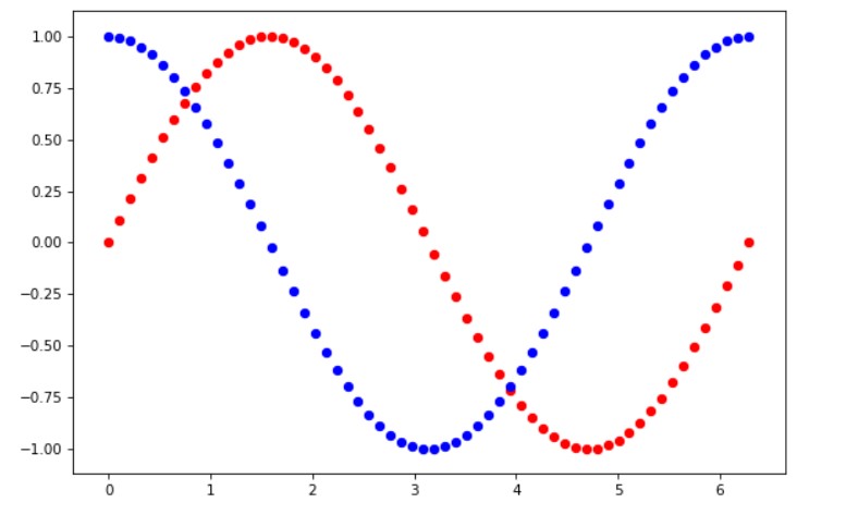
Multiple scatter
Here we combine two scatter plots like before we combined several plots.
import math as m
import numpy as np

t = np.linspace(0, 2*math.pi, 40)
a = np.sin(t)
b = np.cos(t)
c = a + b

plt.scatter(t, a, c='r')
plt.scatter(t, b, c='b')
plt.show()
Different scatter color
from matplotlib import pyplot as plt
plt.figure(figsize=(5, 5), dpi=150)
plt.title('stars')
co = ['g']+['r', 'g', 'b']*33
plt.scatter(train_data[:,0], train_data[:,1], s=55, c=co, marker="*")
plt.scatter(train_data[:,1], train_data[:,0], s=1, c='c')
plt.show()

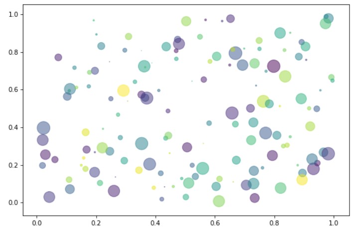
Different scatter size
import numpy as np
import matplotlib.pyplot as plt
np.random.seed(1001) # to reproduce
N = 150
x = np.random.rand(N)
y = np.random.rand(N)
colors = np.random.rand(N)
size = (20 * np.random.rand(N))**2
plt.figure(figsize=(9, 6), dpi=75)
plt.scatter(x, y, s=size, c=colors, alpha=0.5)
plt.show()
As we insist on using the subplots the code should better be like this:
import numpy as np
import matplotlib.pyplot as plt
np.random.seed(1001) # to reproduce
N = 150
x = np.random.rand(N)
y = np.random.rand(N)
colors = np.random.rand(N)
size = (20 * np.random.rand(N))**2
fig = plt.figure(figsize=(9, 6), dpi=150)
ax1=fig.add_subplot(1,1,1)
ax1.title.set_text('title')
ax1.set_xlabel('x label')
ax1.set_ylabel('y label')
ax1.scatter(x, y, s=size, c=colors, alpha=0.5)
plt.show()
Multiple subplots
import matplotlib.pyplot as plt
t = np.linspace(0, 2*math.pi, 60)
a = np.sin(t)
fig = plt.figure(figsize=(9, 6), dpi=100)
ax1=fig.add_subplot(2,2,1)

ax1.scatter(t,a,c='c')
ax2=fig.add_subplot(222)
ax2.scatter(t,a,c='g')
ax3=fig.add_subplot(223)
ax3.scatter(t,a,c='r')
ax4=fig.add_subplot(224)
ax4.scatter(t,a,c='m')
plt.show()
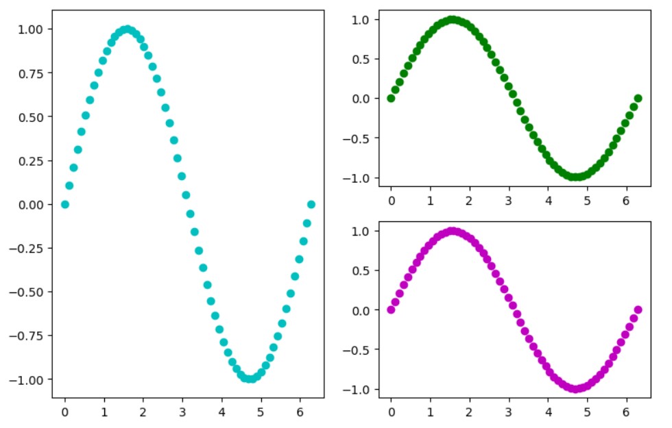
If you would remove the third subplot and make the first one double in size this would look like:
import matplotlib.pyplot as plt
t = np.linspace(0, 2*math.pi, 60)
a = np.sin(t)
fig = plt.figure(figsize=(9, 6), dpi=100)
ax1=fig.add_subplot(1,2,1)
ax1.scatter(t,a,c='c')
ax2=fig.add_subplot(2,2,2)
ax2.scatter(t,a,c='g')
ax4=fig.add_subplot(2,2,4)
ax4.scatter(t,a,c='m')
plt.show()
Lines
Example:
import matplotlib.pyplot as plt
fig, ax = plt.subplots(figsize = (7,5), dpi=150 )
ax.vlines(5,1,2,colors='r')
ax.vlines(3,1,2,colors='r')
ax.vlines(4,0,3,colors='r')
ax.hlines(5,1,2,colors='g')
ax.hlines(2,0,3,colors='g')
ax.hlines(3,1,2,colors='g')
x1, y1 = [-1, 5], [1, 4]
ax.plot(x1, y1, marker = 'o')
plt.show()
Output:

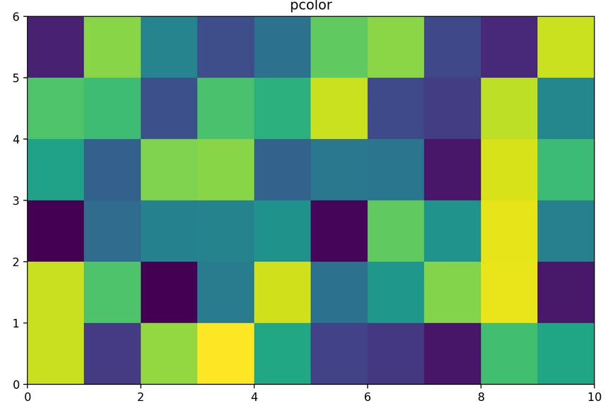
Pcolor and Pcolormesh
import matplotlib.pyplot as plt
import numpy as np

Z = np.random.rand(6, 10)
fig, (ax0) = plt.subplots(1, 1)
c = ax0.pcolor(Z)
ax0.set_title('pcolor')
plt.show()
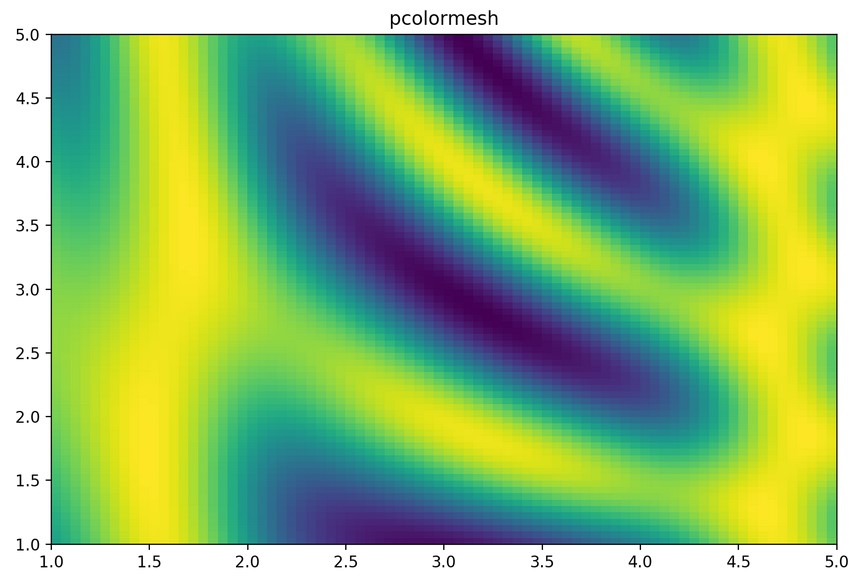
We can just have the random values and using pcolor or pcolormesh we can draw the mesh.
However, the more realistic is to create the grid.
import matplotlib.pyplot as plt
import numpy as np

dx, dy = 0.05, 0.05
y, x = np.mgrid[slice(1, 5 + dy, dy),
                slice(1, 5 + dx, dx)]
z = np.sin(x)**10 + np.cos(10 + y*x) * np.cos(x)
fig, (ax0) = plt.subplots(1, 1)
c = ax0.pcolormesh(x,y,z)
ax0.set_title('pcolormesh')
plt.show()
…
tags: random forests & category: python