Frequent and notable seaborn graphs

Sometimes mathplotlib is not the best fit. You can do nice things smarter if you use seaborn that is based on mathplotlib and numpy.
Table of contents:
- How to start?
- Seaborn import
- Controlling the style
- Types of graphs
- Relational plots
- Categorical plots
- Distribution plots
- Regression plots
- Matrix plots
- Multiplots
- Appendix
How to start?
You may ask what is the procedure to draw a graph using seaborn? What you need to do first, and how can you tweak it afterwords?
First you need to load the seaborn using import seaborn. Then you need to load the dataset. In between you need to set the plotting style.
Then you need to select the type of the graph.
Seaborn import
It is common for seaborn to have the alias sns, but I saw also saw the next aliases:
# pick one of these
import seaborn as sns
import seaborn as sn
import seaborn as sb
Controlling the style
There are few commands for the style control:
-
set aesthetics:
set([context, style, palette, font, …]) -
return dict for the aesthetic:
axes_style([style, rc]) -
set dict for aesthetics:
set_style([style, rc]) -
return scale dict of the figure:
plotting_context([context, font_scale, rc]) -
set the plotting context parameters:
set_context([context, font_scale, rc]) -
change how matplotlib colors:
set_color_codes([palette]) -
restore all rc params to default:
reset_defaults() -
restore all rc params to original settings:
reset_orig()
Types of graphs
- Relational plots (like lineplot)
- Categorical plots (like boxplot)
- Distribution plots (like distplot)
- Regression plots (like regplot)
- Matrix plots (like heatmap)
- Multi-plots grids (facet,pair, joint)
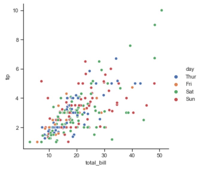
Relational plots
relplot()
import seaborn as sns
sns.set(style="ticks")
tips = sns.load_dataset("tips")
g = sns.relplot(x="total_bill", y="tip", hue="day", data=tips)
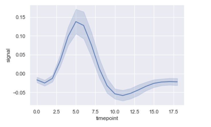
lineplot()
import seaborn as sns
fmri = sns.load_dataset("fmri")
ax = sns.lineplot(x="timepoint", y="signal", data=fmri)
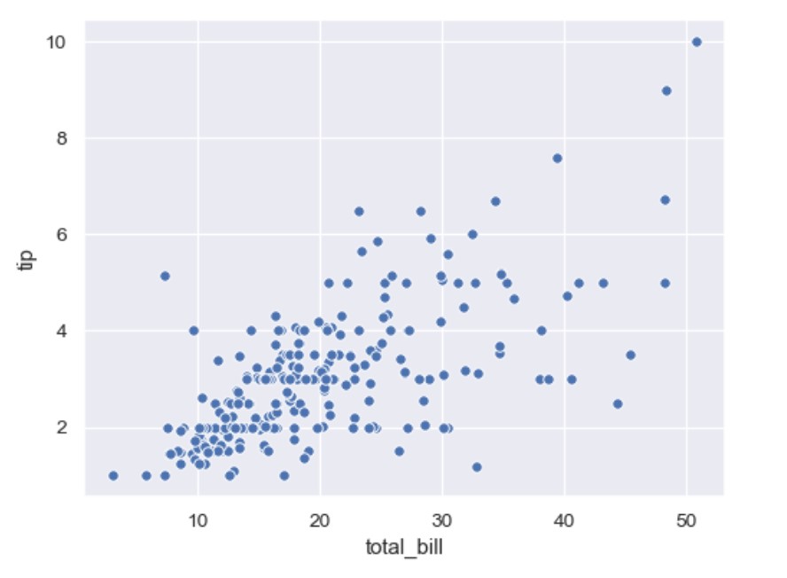
scatterplot
import seaborn as sns
tips = sns.load_dataset("tips")
ax = sns.scatterplot(x="total_bill", y="tip", data=tips)
Categorical plots
Boxplot
Univariate Boxplot
Let’s check this univariate analysis boxplot.
import seaborn as sns
sns.set(style="whitegrid")
tips = sns.load_dataset("tips")
ax = sns.boxplot(x=tips["total_bill"])
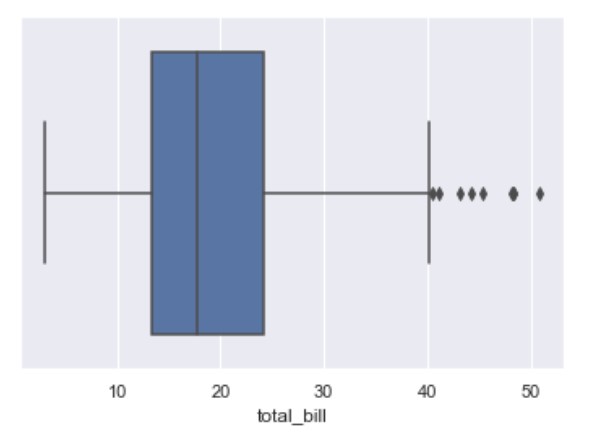
The ratio from blue box can be explained from the image:
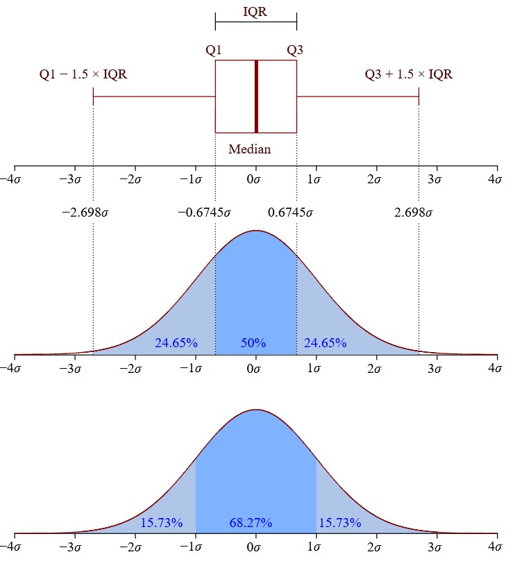
The values that separate parts are called the first, second, and third quartiles; and they are denoted by Q1, Q2, and Q3, respectively.
The edges of the blue box are Q1 and Q3, and between them should be the median. The formula to calculate the interquartile range is this:
\[IQR = Q3 − Q1\]The values out of the $[Q1 - 1.5 \cdot IQR, Q3 + 1.5 \cdot IQR]$ range are treated as outliers. These are denoted with diamonds.
Bivariate Boxplot
We can do bivariate analysis:
import seaborn as sns
sns.set(style="darkgrid") # default
tips = sns.load_dataset("tips")
ax = sns.boxplot(x="tip", y="day", data=df[df["sex"]=='Male'])
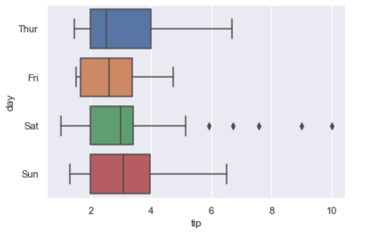
Note you can set x and y with the DataFrame data in wich case data argument is not needed.
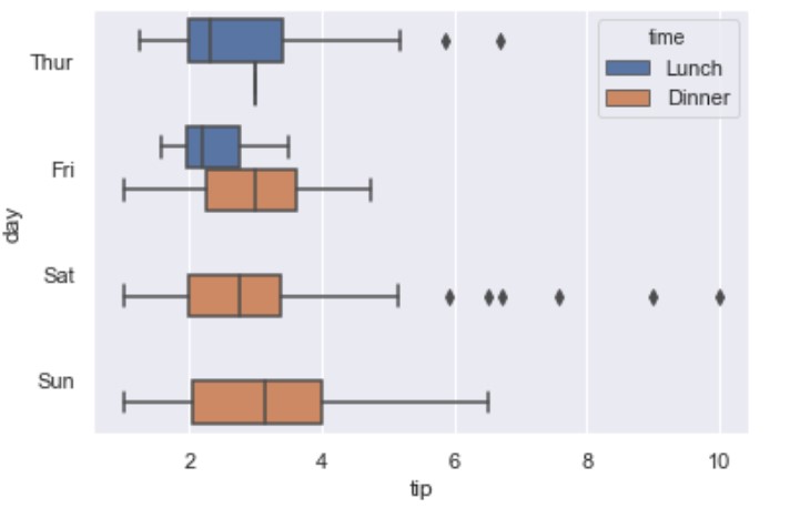
Multivariate Boxplot
You can use hue to achieve this:
import seaborn as sns
tips = sns.load_dataset("tips")
ax = sns.boxplot(x="tip", y="day", hue="time",  data=tips)
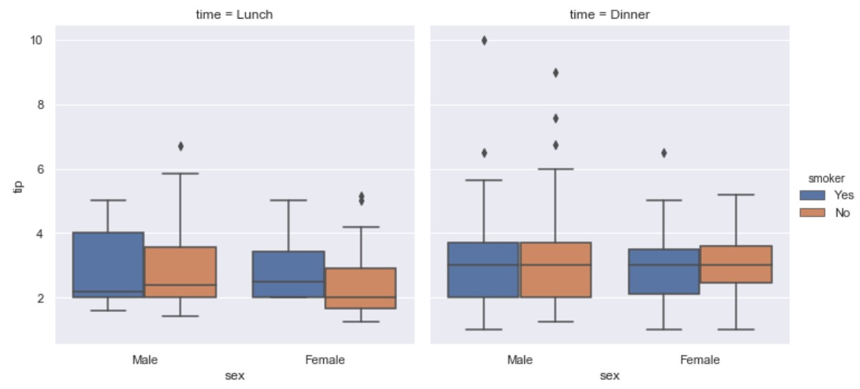
Swarmplot
If you wanted to present the datapoints on top of the boxes use swarmplot():
import seaborn as sns
tips = sns.load_dataset("tips")
ax = sns.boxplot(x="day", y="tip", data=tips)
ax = sns.swarmplot(x="day", y="tip", data=tips, color=".25")
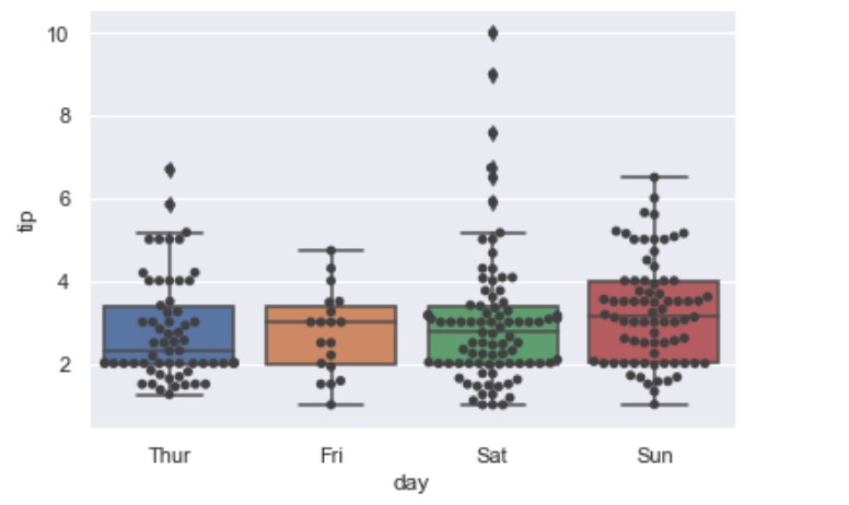
It should have the same parameters as the boxplot plus it should have the color.
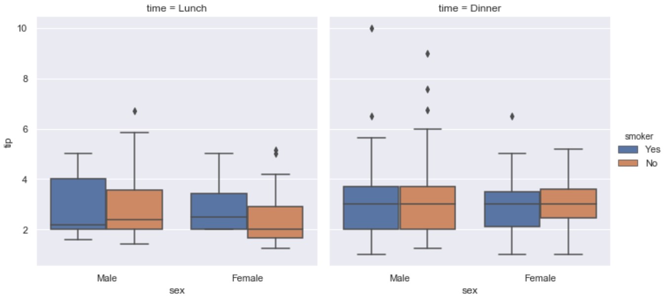
Catplot (category plots)
To dupe the boxplot we may set: kind=”box”.
import seaborn as sns
tips = sns.load_dataset("tips")
ax = sns.catplot(x="sex", y="tip", hue="smoker",
col="time", data=tips, kind="box")
But catplot provides other kind= options:
Scatter plots:
- stripplot() (with kind=”strip”; the default)
- swarmplot() (with kind=”swarm”)
Distributions plots:
- boxplot() (with kind=”box”)
- violinplot() (with kind=”violin”)
- boxenplot() (with kind=”boxen”)
Estimate plots:
- pointplot() (with kind=”point”)
- barplot() (with kind=”bar”)
- countplot() (with kind=”count”)
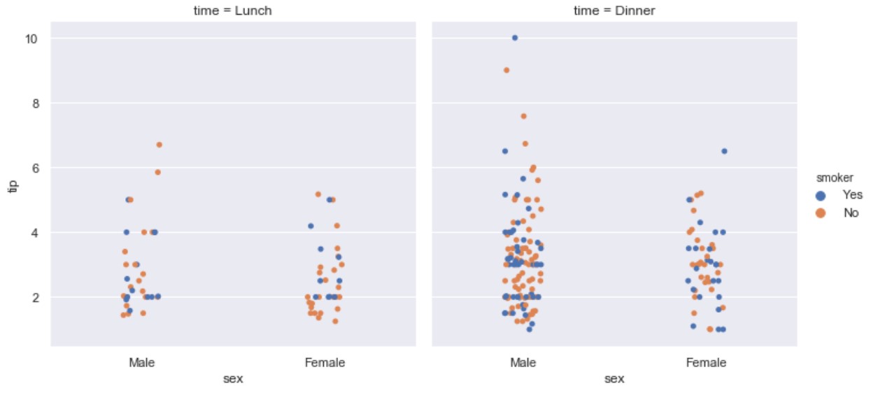
kind=strip
import seaborn as sns
tips = sns.load_dataset("tips")
ax = sns.catplot(x="sex", y="tip", hue="smoker",
col="time", data=tips, kind="strip")
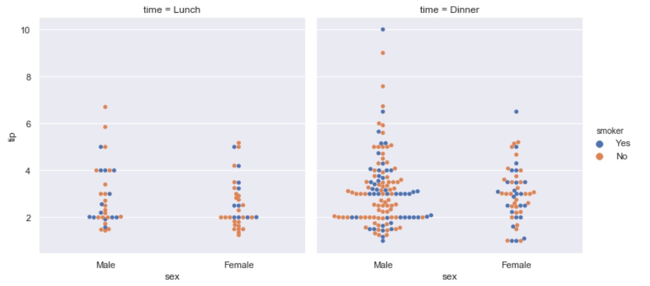
kind=swarm
import seaborn as sns
tips = sns.load_dataset("tips")
ax = sns.catplot(x="sex", y="tip", hue="smoker",
col="time", data=tips, kind="swarm")
kind=box
import seaborn as sns
tips = sns.load_dataset("tips")
ax = sns.catplot(x="sex", y="tip", hue="smoker",
col="time", data=tips, kind="box")
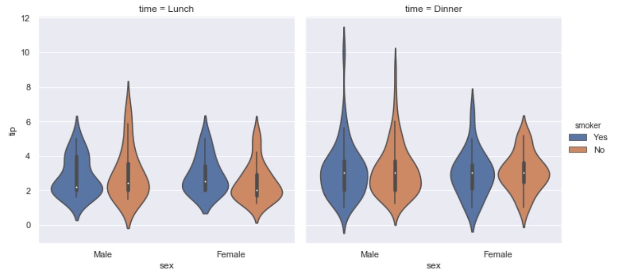
kind=violin
import seaborn as sns
tips = sns.load_dataset("tips")
ax = sns.catplot(x="sex", y="tip", hue="smoker",
col="time", data=tips, kind="violin")
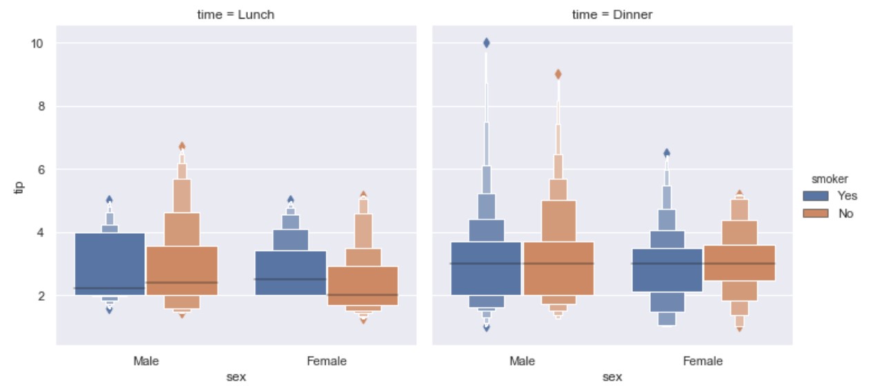
kind=boxen
import seaborn as sns
tips = sns.load_dataset("tips")
ax = sns.catplot(x="sex", y="tip", hue="smoker",
col="time", data=tips, kind="boxen")
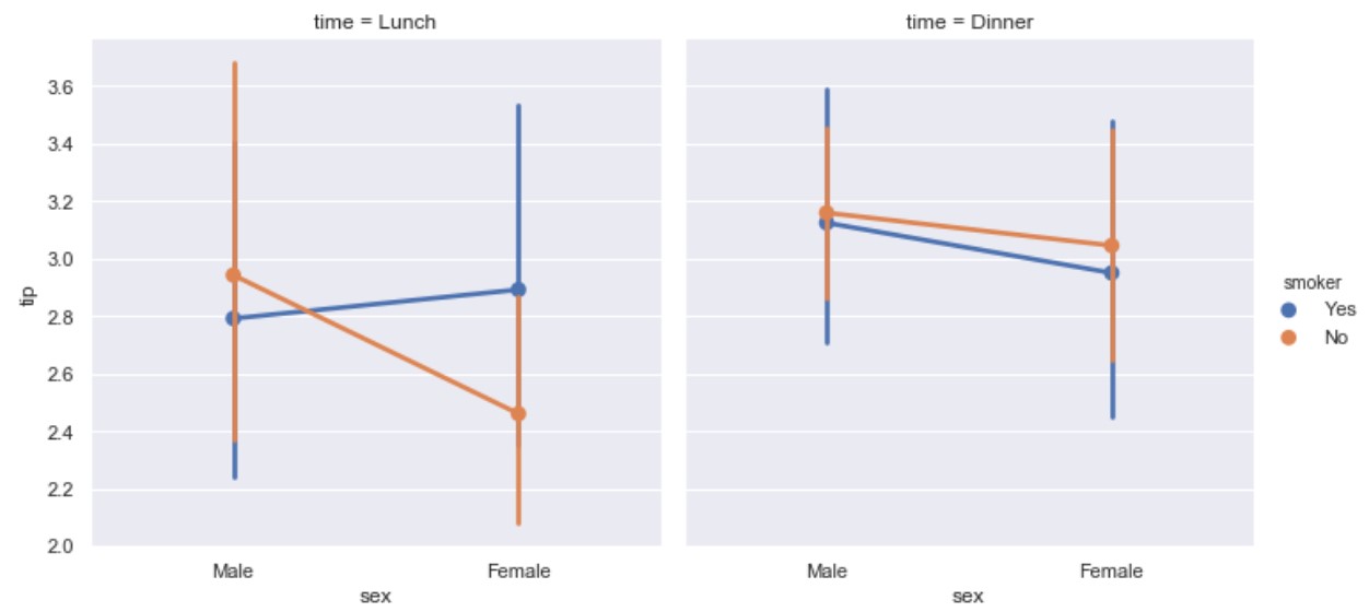
kind=point
import seaborn as sns
tips = sns.load_dataset("tips")
ax = sns.catplot(x="sex", y="tip", hue="smoker",
col="time", data=tips, kind="point")
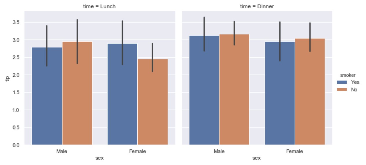
kind=bar
import seaborn as sns
tips = sns.load_dataset("tips")
ax = sns.catplot(x="sex", hue="smoker",
col="time", data=tips, kind="bar")
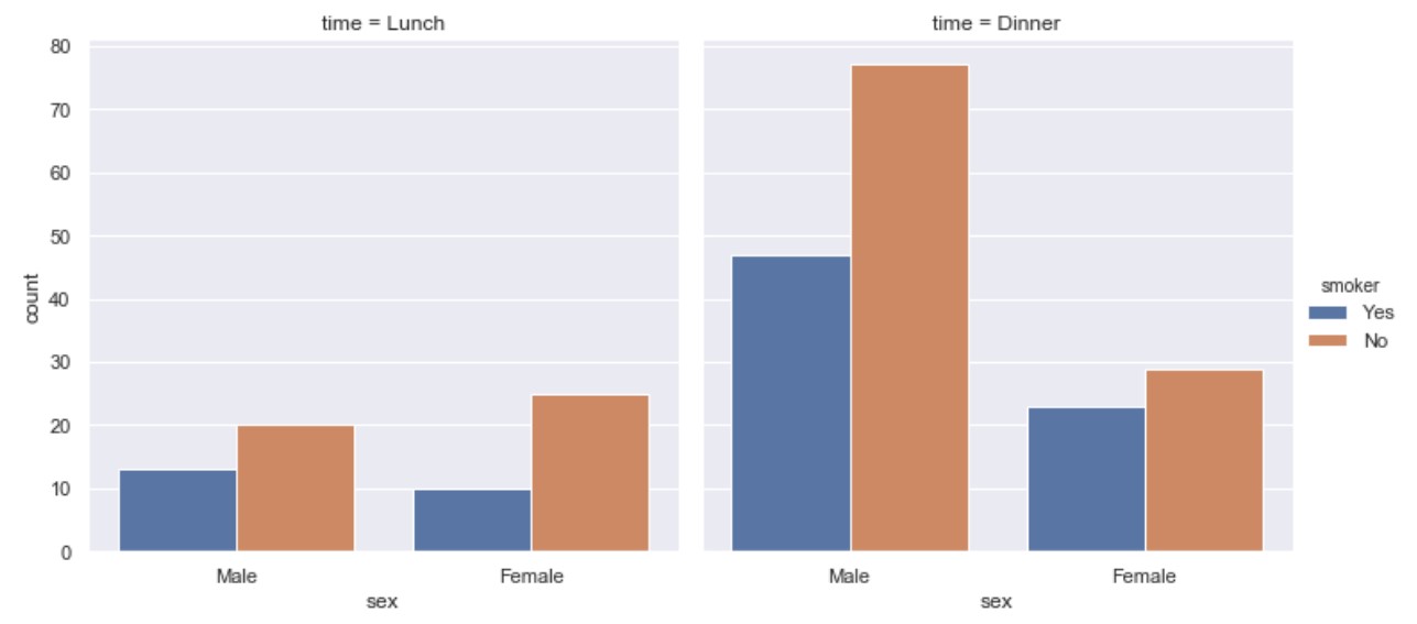
kind=count
import seaborn as sns
tips = sns.load_dataset("tips")
ax = sns.catplot(x="sex", hue="smoker",
col="time", data=tips, kind="count")
Distribution plots
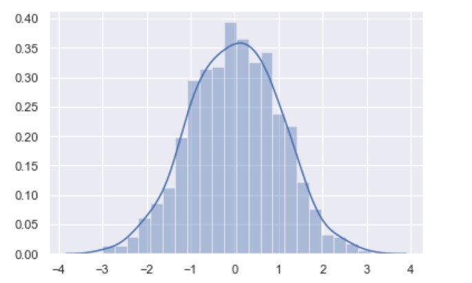
displot()
Displot() is matplotlib hist with auto bin size. It can also fit scipy.stats distributions and plot the estimated PDF over the data.
import seaborn as sns
import numpy as np
x = np.random.randn(1000)
ax = sns.distplot(x)
kdeplot()
import numpy as np; np.random.seed(10)
import seaborn as sns
mean, cov = [0, 2], [(1, .5), (.5, 1)]
x, y = np.random.multivariate_normal(mean, cov, size=50).T
ax = sns.kdeplot(x)
ax = sns.kdeplot(y)
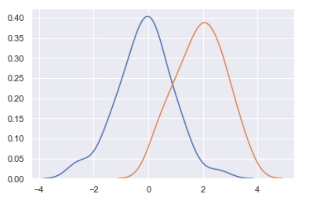
You can use kdeplot to plot both x and y.
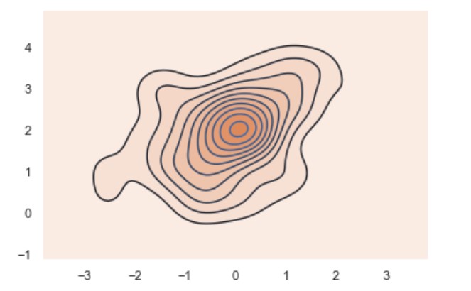
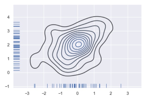
ax = sns.kdeplot(x, y)
ax = sns.kdeplot(x, y, shade=True)
rugplot()
Plot datapoints in an array as sticks on an axis.
import numpy as np; np.random.seed(10)
import seaborn as sns
mean, cov = [0, 2], [(1, .5), (.5, 1)]
x, y = np.random.multivariate_normal(mean, cov, size=50).T
ax = sns.rugplot(x, axis='x')
ax = sns.rugplot(y, axis='y')
ax = sns.kdeplot(x, y)
Regression plots
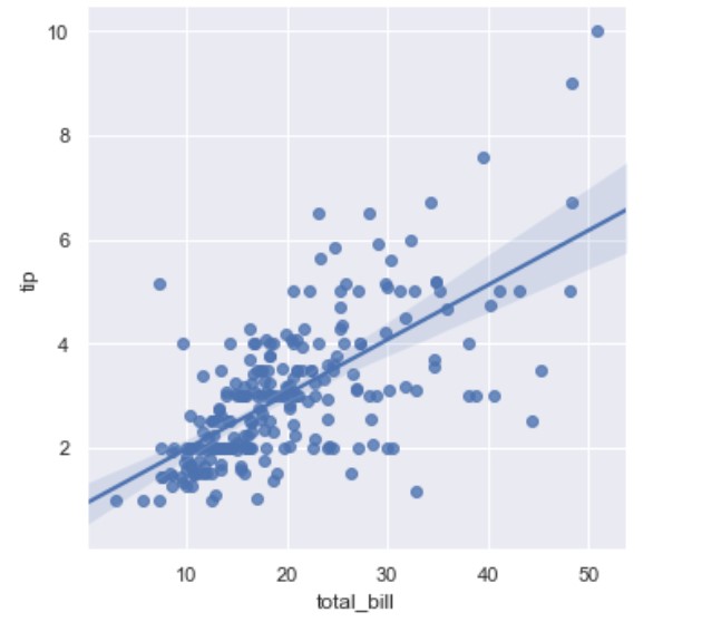
regplot()
import seaborn as sns
sns.set(color_codes=True)
tips = sns.load_dataset("tips")
ax = sns.regplot(x="total_bill", y="tip", data=tips)
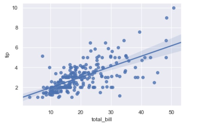
lmplot()
While regplot() performs linear regression model fit and plot, lmplot() combines regplot() and FacetGrid. FacetGrid class helps in visualizing the distribution of one variable as well as the relationship between multiple variables separately.
import seaborn as sns; sns.set(color_codes=True)
tips = sns.load_dataset("tips")
ax = sns.lmplot(x="total_bill", y="tip", fit_reg=True, data=tips)
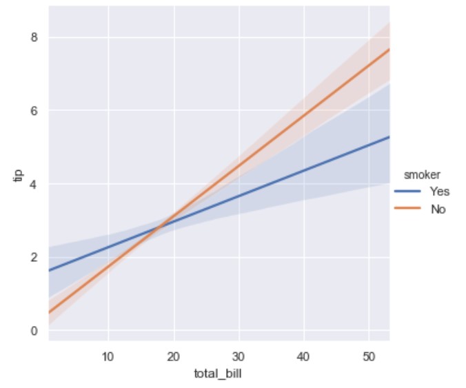
Then we can have hue parameter to to distinct on smoker or not:
import seaborn as sns
tips = sns.load_dataset("tips")
ax = sns.lmplot(x="total_bill", y="tip", hue="smoker", fit_reg=True, data=tips)
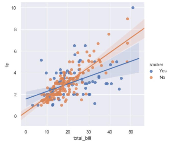
There you may note the line in the middle; this is the regression line. You can get rid of this line if you set fit_reg=False.
If you would like to remove the scatter use: scatter=False
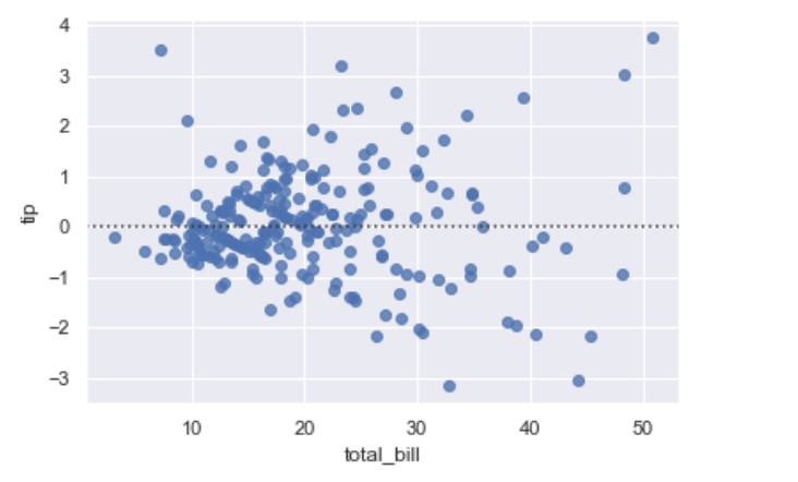
residplot()
This function will regress y on x using polynomial regression or M-regression also called robust regression. M-regression uses reweighted least squares. There are two major methods for M-regression: Huber and Tukey.
This will bann using traditional least squares estimates for regression models since they are highly sensitive to outliers.
A residual is the difference between the observed y-value (from scatter plot) and the predicted y-value (from regression equation line). It is the vertical distance from the actual plotted point to the point on the regression line. You can think of a residual as how far the data “fall” from the regression line.
import seaborn as sns; sns.set(color_codes=True)
tips = sns.load_dataset("tips")
ax = sns.residplot(x="total_bill", y="tip", robust=True, data=tips)
Matrix plots
heatmap()
import seaborn as sns
sns.reset_defaults()
a =  [[ randint(1, 10) for c in range(0, 10)] for r in range (0,10)]
df = pd.DataFrame(a)
ax = sns.heatmap(df)
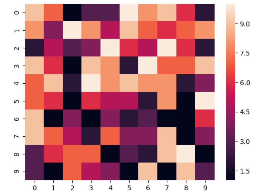
In some cases for some older versions of matplotlib use this:
bottom, top = ax.get_ylim()
ax.set_ylim(bottom + 0.5, top - 0.5)
You can use heatmaps to display correlation, but this works just for the numberic features.
import seaborn as sns
iris = sns.load_dataset("tips")
plt.figure(figsize=(25,10))
ax = sns.heatmap(iris.corr(), annot=True)
bottom, top = ax.get_ylim()
ax.set_ylim(bottom + 0.5, top - 0.5)
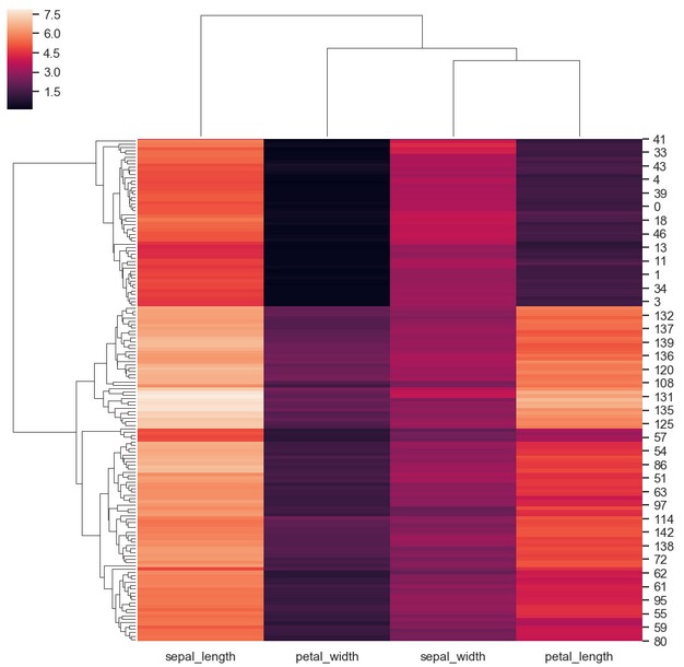
clustermap()
import seaborn as sns
sns.set(color_codes=True)
iris = sns.load_dataset("iris")
species = iris.pop("species")
ax = sns.clustermap(iris)
Multiplots
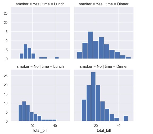
FacetGrid()
import seaborn as sns
import matplotlib.pyplot as plt
tips = sns.load_dataset("tips")
ax = sns.FacetGrid(tips, col="time",  row="smoker")
ax = ax.map(plt.hist, "total_bill")
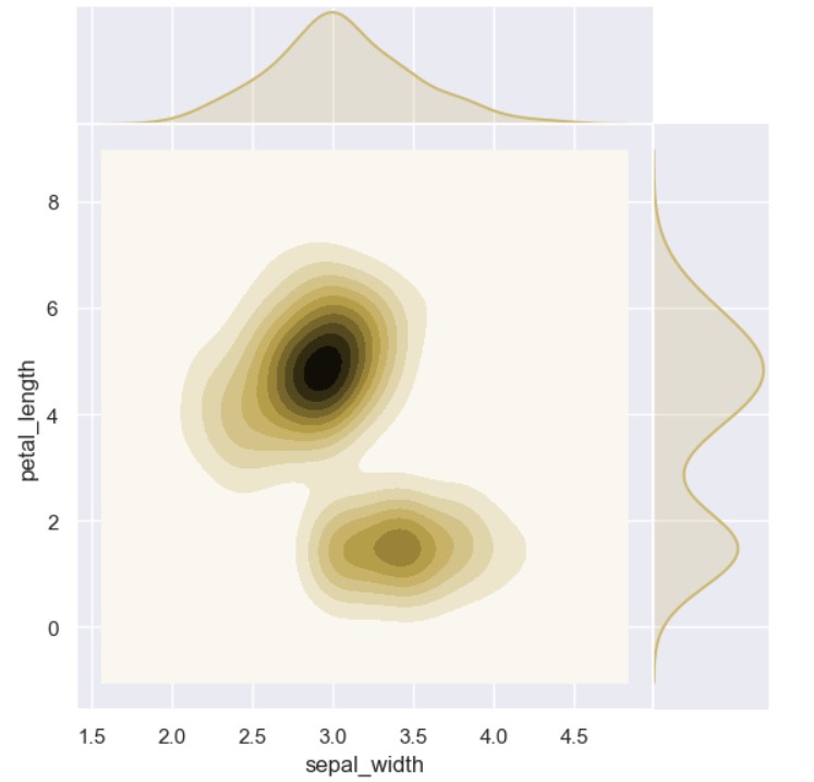
jointplot()
import seaborn as sns
iris = sns.load_dataset("iris")
ax = sns.jointplot("sepal_width", "petal_length", data=iris, kind="kde", space=0, color="y")
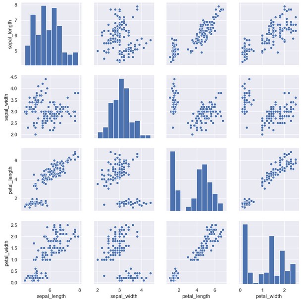
pairplot()
It returns histograms on diagonal, else scatterplot.
import seaborn as sns
iris = sns.load_dataset("iris")
ax = sns.pairplot(iris)
Appendix
Univariate analysis
Univariate analysis where we analyse single variable (age or height or date of birth). This analysis should describe the data and find patterns inside.
Bivariate analysis
Bivariate analysis checks two different variables. This may be as simple as creating a scatterplot (X and Y axis).
If the scatterplot seams to fit to a line there is a relationship (correlation). For example (age vs. height).
Multivariate analysis
Multivariate analysis considers more than two variables. Some of these methods include:
- Additive Tree
- Canonical Correlation Analysis
- Cluster Analysis
- Correspondence Analysis
- Factor Analysis
- Generalized Procrustean Analysis
- MANOVA
- Multidimensional Scaling,
- Multiple Regression Analysis
- Partial Least Square Regression
- PCA
- Regression / PARAFAC
- Redundancy Analysis
…
tags: graphs - seaborn - mathplotlib - pyplot & category: python