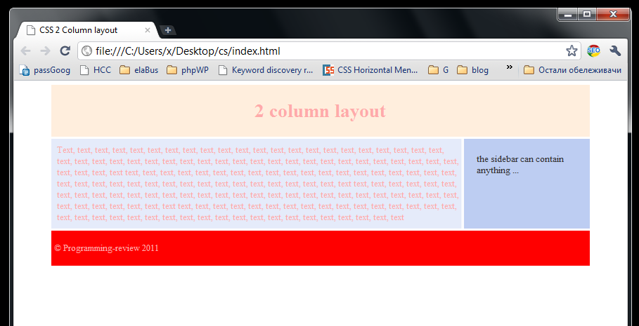
Minimal 2-columns website layout
Here div C represents the container. Divs H represents the header, div A represents the main content area, div B is the sidebar div, and the div F is the footer.
We used all the tips from the tutorial here.
First we used overflow: auto; in the container div C. This will center the container div as we explained in the first article of this tutorial How to set the div in the center of a web browser using margins.
Then, you noticed that all the divs inside the container div C are non overlapping — as explained in the Adding child divs to a parent div article.
We used floating divs to construct the layout and we used clear: both clearing as explained in Floating divs article.
We also used an image in the container div for better visual experience.
#C {
 background: url(background.png);
}
You may download the background image from here.
Test the demo from HERE.
Hope you have enjoyed the tutorial and good luck with your website design.
…
tags: & category: -
