Floating divs
<html>
<head>
<style type="text/css">
div.C {margin:auto; width:40em;}
div.H {background:pink;}
div.A {float: left; width:50%; background:red;}
div.B {float: right; width: 50%; background:green;}
div.F {background:yellow;}
</style>
</head>
<body>
<div class="C">
<div class="H">Header</div>
<div class="A">Left floating div</div>
<div class="B">Right floating div</div>
<div class="F">Footer</div>
</div>
</body>
</html>
You may find how to improve this basic design by adding an additional div that holds the menu from Robert Johnson web site here.
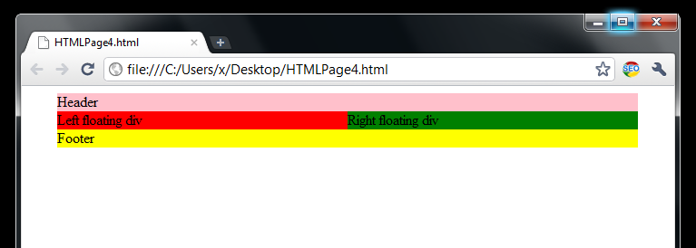
Notice the perfect-body we are having here and how the divs markups do not overlap.
<body>
<div class="C">
<div class="H">Header</div>
<div class="A">Left floating div</div>
<div class="B">Right floating div</div>
<div class="F">Footer</div>
</div>
</body>
All divs are inside the container div C, div H representing the header, div A typically representing the main content, div B typically representing the sidebar, and div F representing the footer.
One small tip here: Why the div A that typically represents the main article content stands before the div B? Because of SEO. You need to feed the web crawlers with the most important content first.
Also there are 2 major tips we need to learn about floating divs:
Major tip #1: When using float on divs, their position should be set to static which is by default.
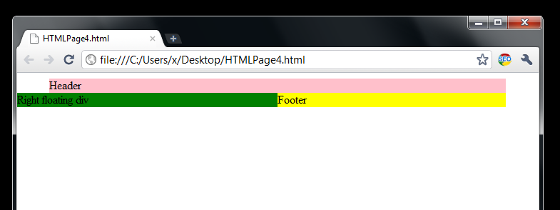
Otherwise if relative, absolute, or fixed position is used you may ruin the web design. Let’s demonstrate the major tip #1:
<html>
<head>
<style type="text/css">
div.C {margin:auto; width:40em;}
div.H {background:pink;}
div.A {float: left; width:50%; background:red;}
div.B {float: right; width: 50%; background:green; position:absolute; left:0em;}
div.F {background:yellow;}
</style>
</head>
<body>
<div class="C">
<div class="H">Header</div>
<div class="A">Left floating div</div>
<div class="B">Right floating div</div>
<div class="F">Footer</div>
</div>
</body>
</html>
Here I set the position absolute for the div B.
In some case you may use position: relative, but with caution.
Major tip #2: Clearing the float.
Divs are block level elements – meaning – each div will always start in a new line. We used floats to make divs float in same line as shown above. When you need to revert to the normal document flow you need to use clear:both;. Here is the perfect example:
<html>
<head>
<style type="text/css">
div.C {margin:auto; width:40em;}
div.H {background:pink;}
div.A {float: left; width:30%; background:red;}
div.B {float: right; width: 30%; background:green; }
div.F {background:yellow;}
</style>
</head>
<body>
<div class="C">
<div class="H">Header</div>
<div class="A">Left floating div</div>
<div class="B">Right floating div</div>
<div class="F">Footer</div>
</div>
</body>
</html>
Now you will see the footer between the “Left floating div” and “Right floating div”, but that’s not good. We need the footer in the separate line. Here is how to do it.
<html>
<head>
<style type="text/css">
div.C {margin:auto; width:40em;}
div.H {background:pink;}
div.A {float: left; width:30%; background:red;}
div.B {float: right; width: 30%; background:green; }
div.F {background:yellow; clear:both;}
</style>
</head>
<body>
<div class="C">
<div class="H">Header</div>
<div class="A">Left floating div</div>
<div class="B">Right floating div</div>
<div class="F">Footer</div>
</div>
</body>
</html>
And the result will be like this:
The last image shows that after we “cleared” floating the footer div is looking OK. The reason why div floating is most used web site layout technique is the ability to clear the floating anytime and to return to the normal document flow with a single clear:both, clear:left, or clear:right.
In the next article I will demonstrate how to achieve journal styles using divs.
clear:both, clear:left, clear:right
Let’s explain “clear:both”, “clear:left”, “clear:right” statements further. To clear a div with additional “clear” instruction has sense only when the divs are floating. No floating no clearing is possible.
If we have only two divs A and B on the entire HTML page, that are floating, then we can add clear style to the second div B. Adding a clear code to the first div A doesn’t have any sense. Meaning, the relation exists between the element having the clear style and between the element(s) preceding it.
Sometimes developers create divs only for clearing like this:
<div style="clear:both"></div>
This may be considered as good practice.
In a case we have added clear:left to a div B and div A has float:right then div B will go to the new line.
In a case we have added clear:right to a div B and div A has float:left then div B will go to the new line.
Without clearing both divs in previous 2 cases will be inline.
Next article.
…
tags: & category: -


