Adding child divs to a parent div
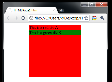
Inserting a div to a container div is simple.
<html>
<head>
<style type="text/css">
div.A {
background-color:red; width:200px; height:200px;
margin-left:auto; margin-right:auto;}
div.B {
background-color:green;
margin-left:auto; margin-right:auto;}
</style>
<body>
<div class="A">This is a red div A
<div class="B">This is a green div B</div>
</div>
</body>
</html>
You may notice the line:
<div class="A">This is a red div A<div class="B">This is a green div B</div></div>
which I don’t like, because this is typical “markup spaghetti” case. You may notice the div A that contains text and also the textual div B. I prefer to have container divs just as placeholders and without any text. This is why I will always rewrite the following example this way:
<html>
<head>
<style type="text/css">

div.A {

background-color:yellow; margin-left:auto; margin-right:auto;}

div.B {

background-color:green; margin-left:auto; margin-right:auto;}

div.C {

background-color:red; width:200px; height:200px;

margin-left:auto; margin-right:auto;}

</style>

<body>
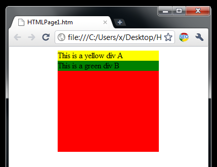
<div class="C">
<div class="A">This is a yellow div A</div>
<div class="B">This is a green div B</div>
</div>
</body>
</html>
Now the container div C is a placeholder, and its child’s A and B are siblings. Having the last tip in mind we can rewrite the title for this article to something like this:
Why adding sibling child divs to a parent placeholder?
Because this is a way to escape the markup spaghetti. Although, this may look like a minor tip, but I believe this is the most important organization idea we should follow when designing web layouts. I examined many professional web design layouts and all of them are using this idea.
In the next example I will provide div positioning tips.
…
tags: & category: css

